Everyman York
Description
Everyman provides a unique cinema experience not seen at many other cinemas in the country. The brief asked for a redesign of the Everyman cinema in York which would provide a new look for the interior, product and graphic design. This project is collaborative so the redesign needed to be discuss amongst members of the group who specialised n interior, product and graphic design to come up with a cohesive redesign.
Deliverables
Print Products
Advertisements
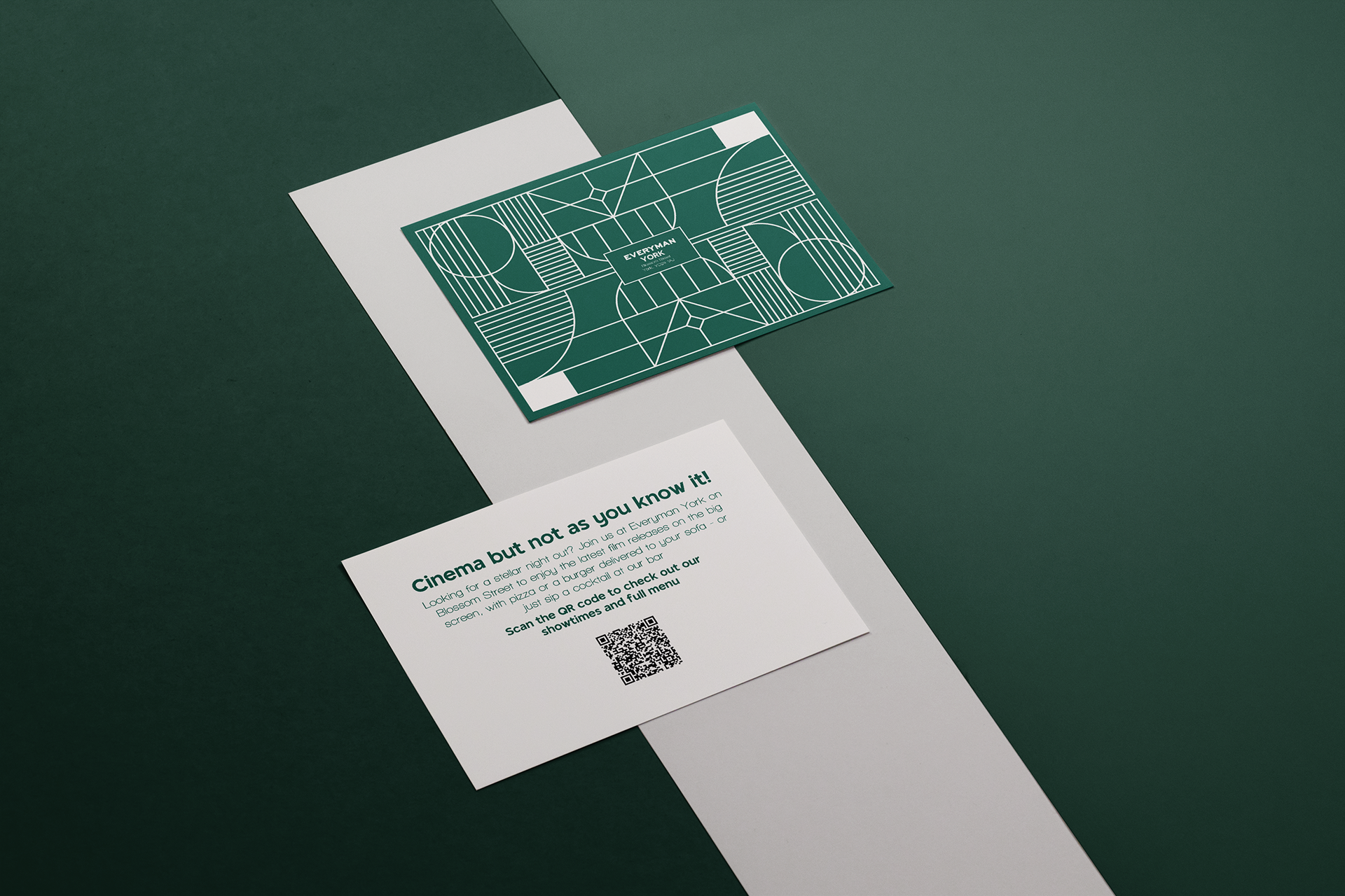
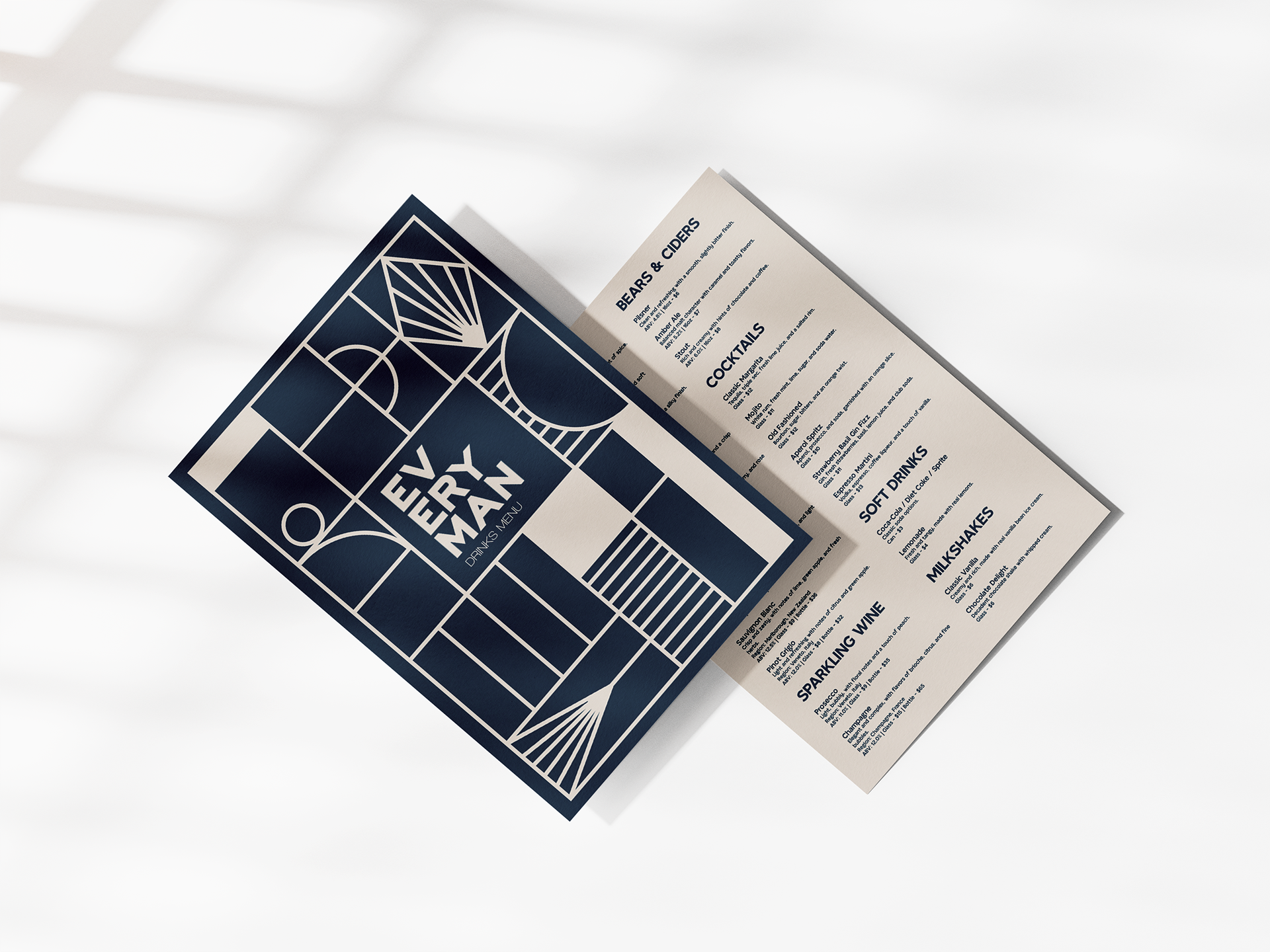
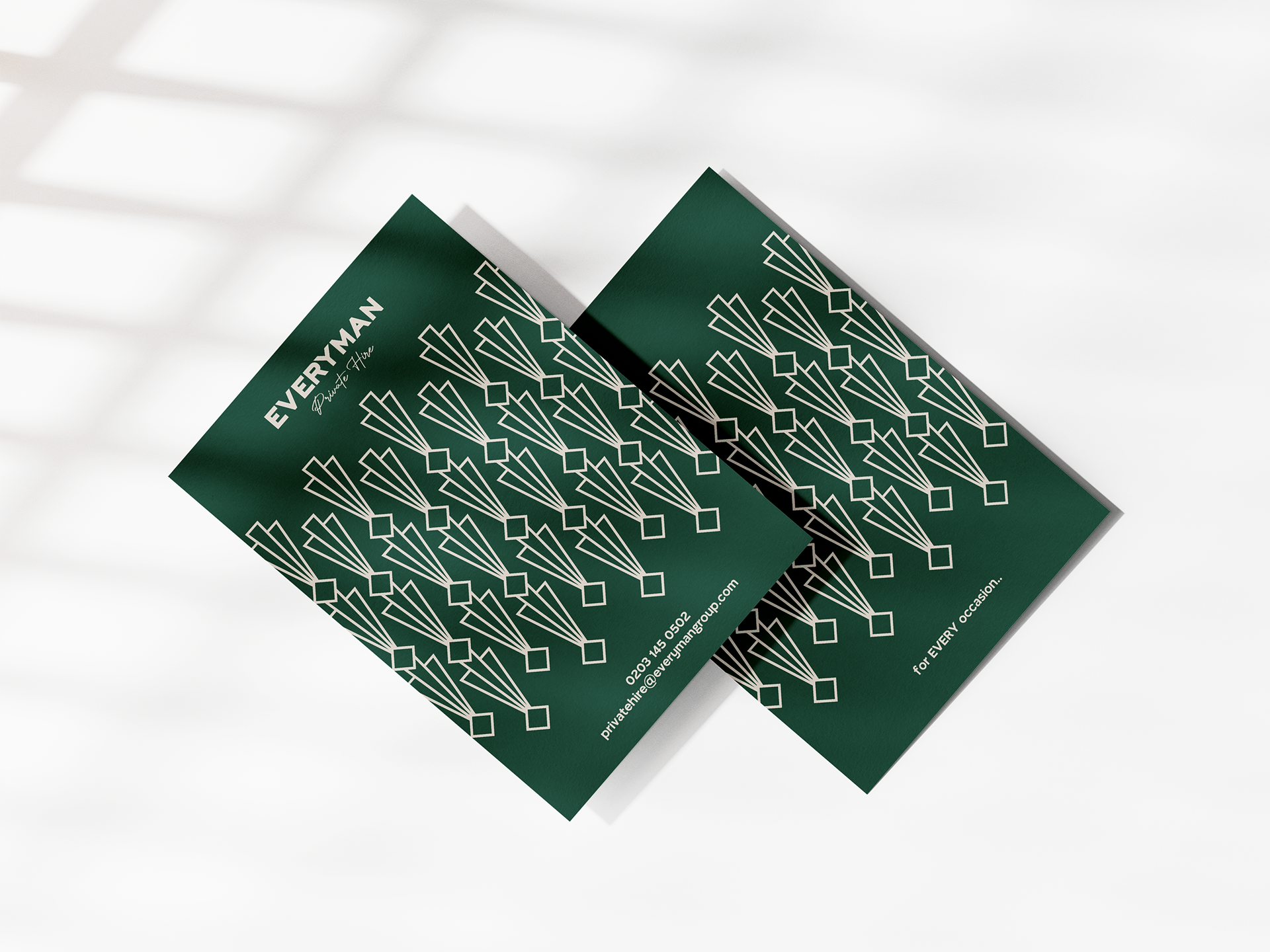
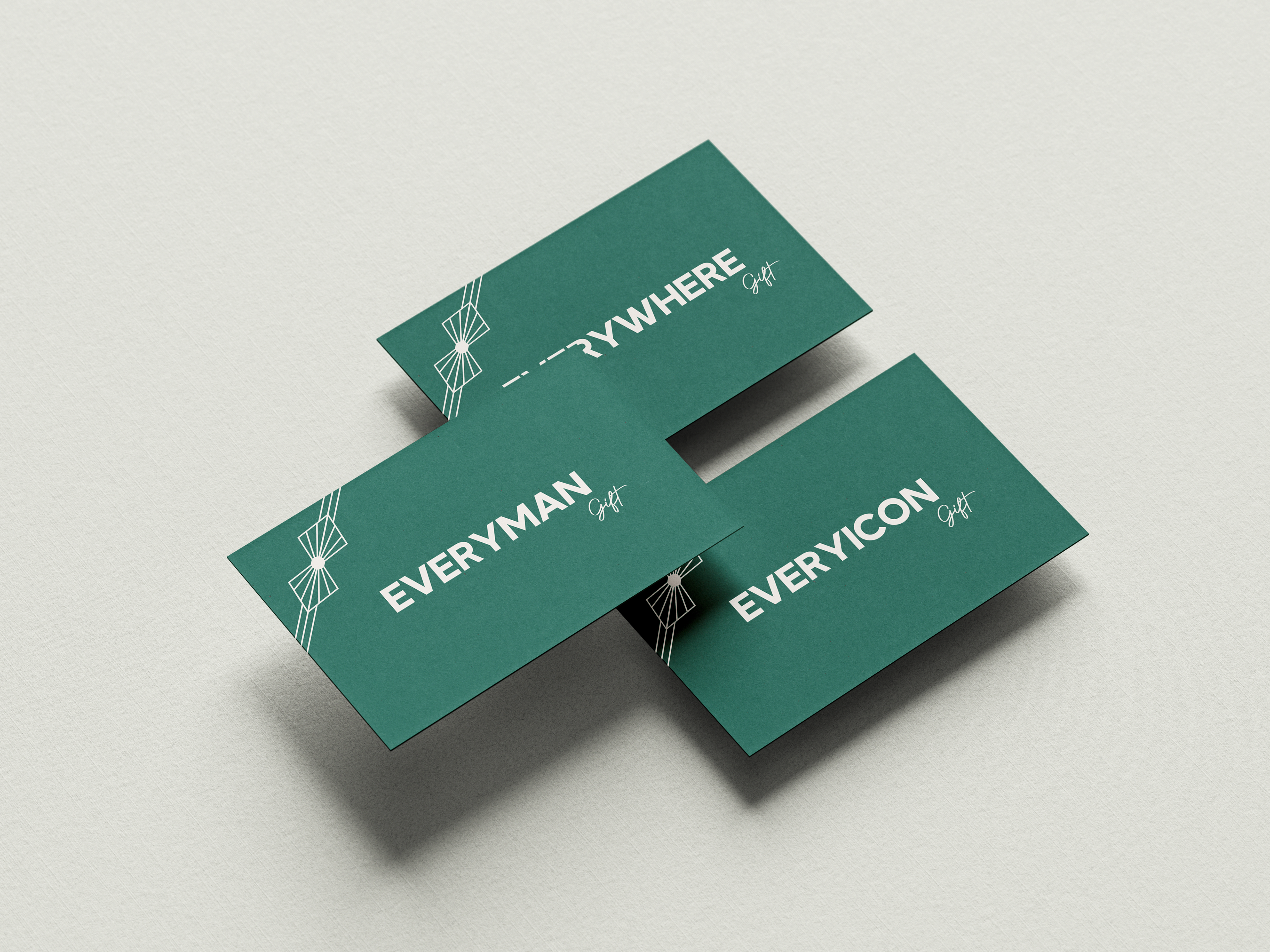
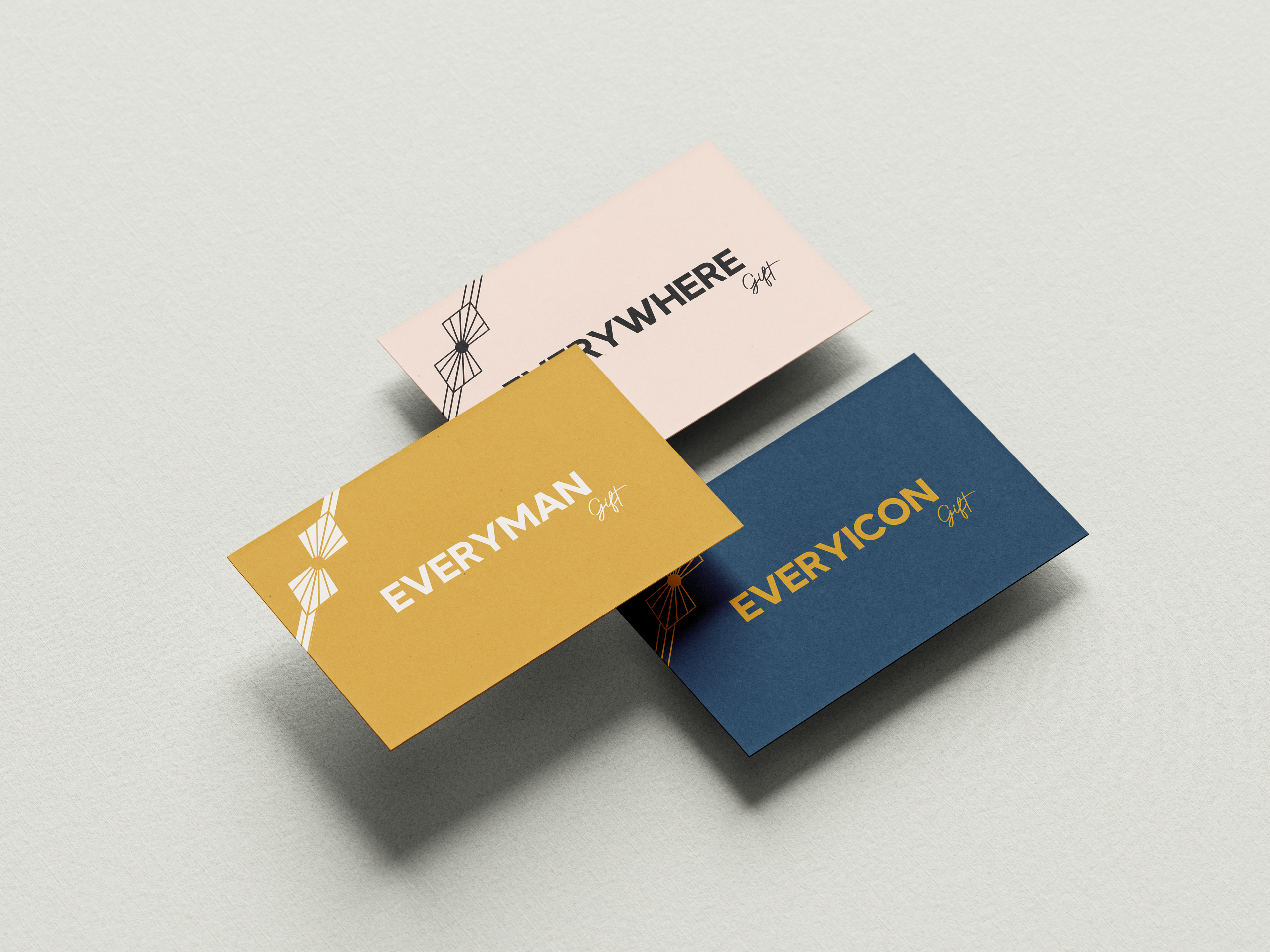
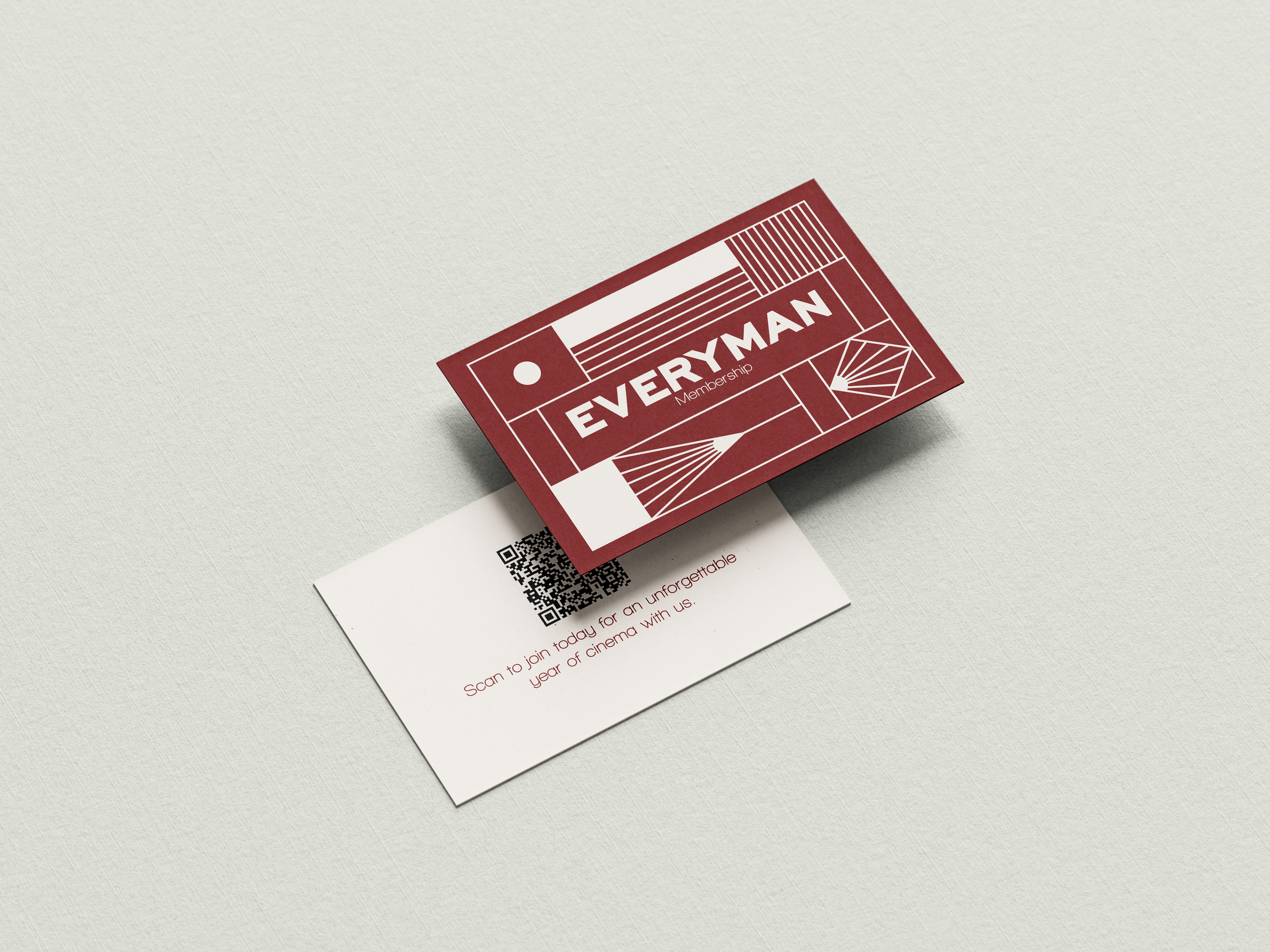
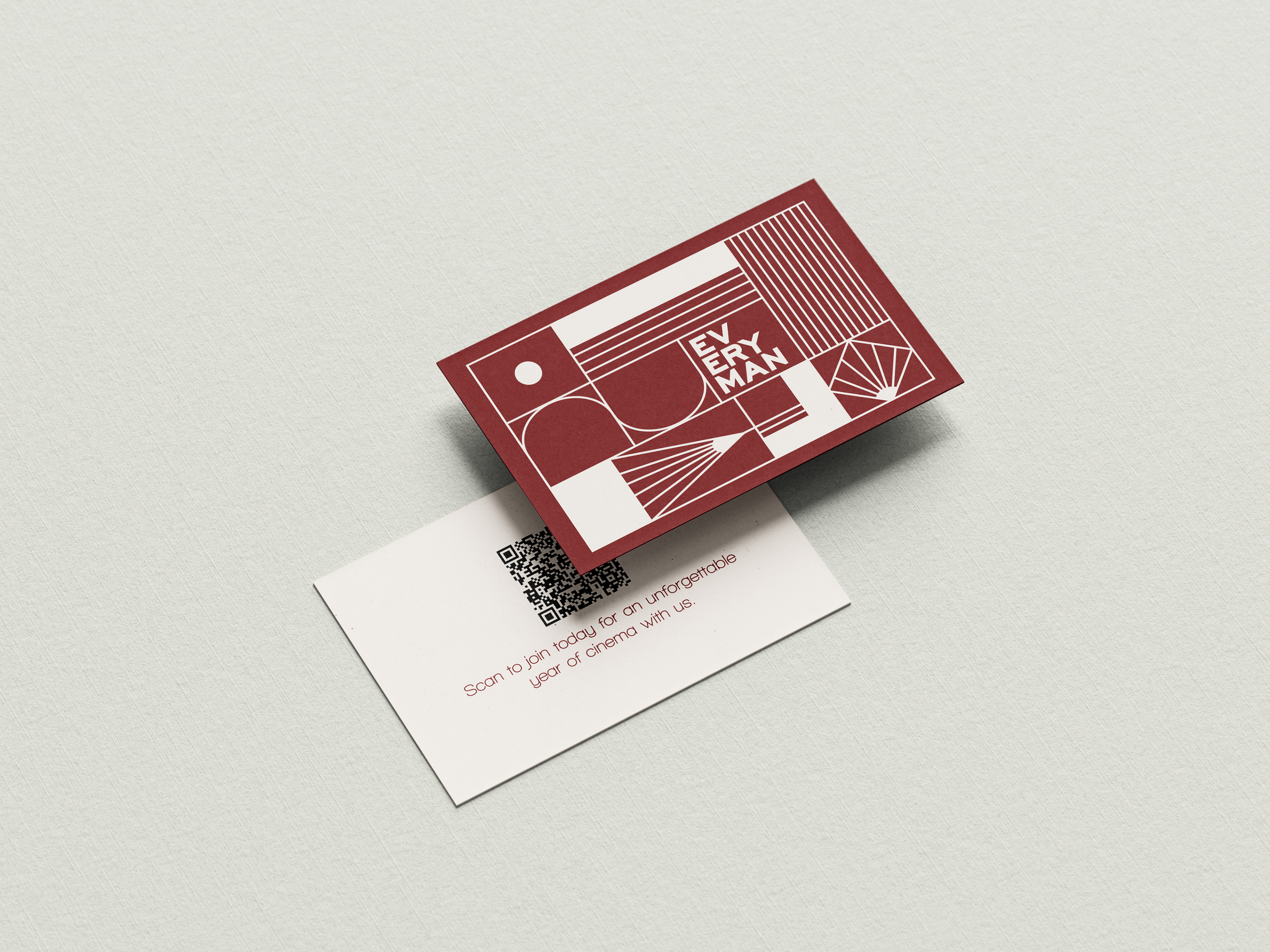
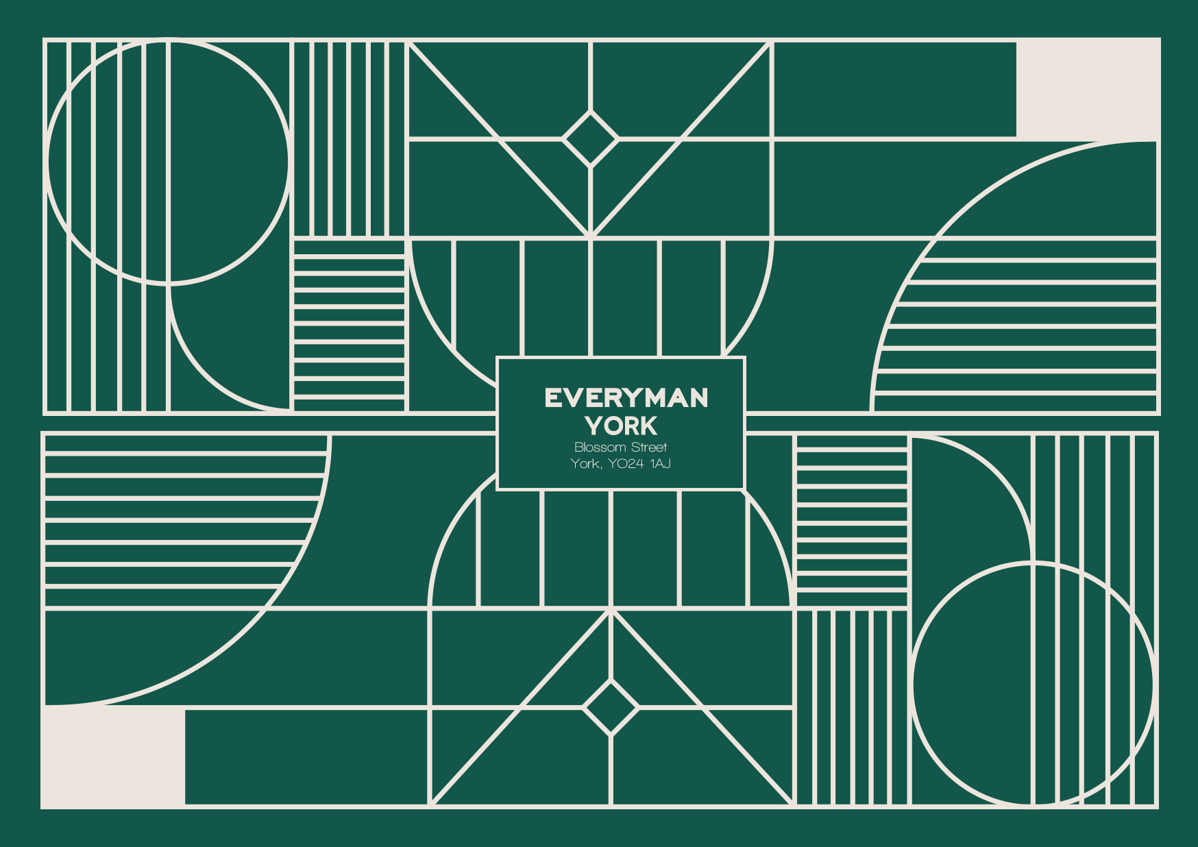
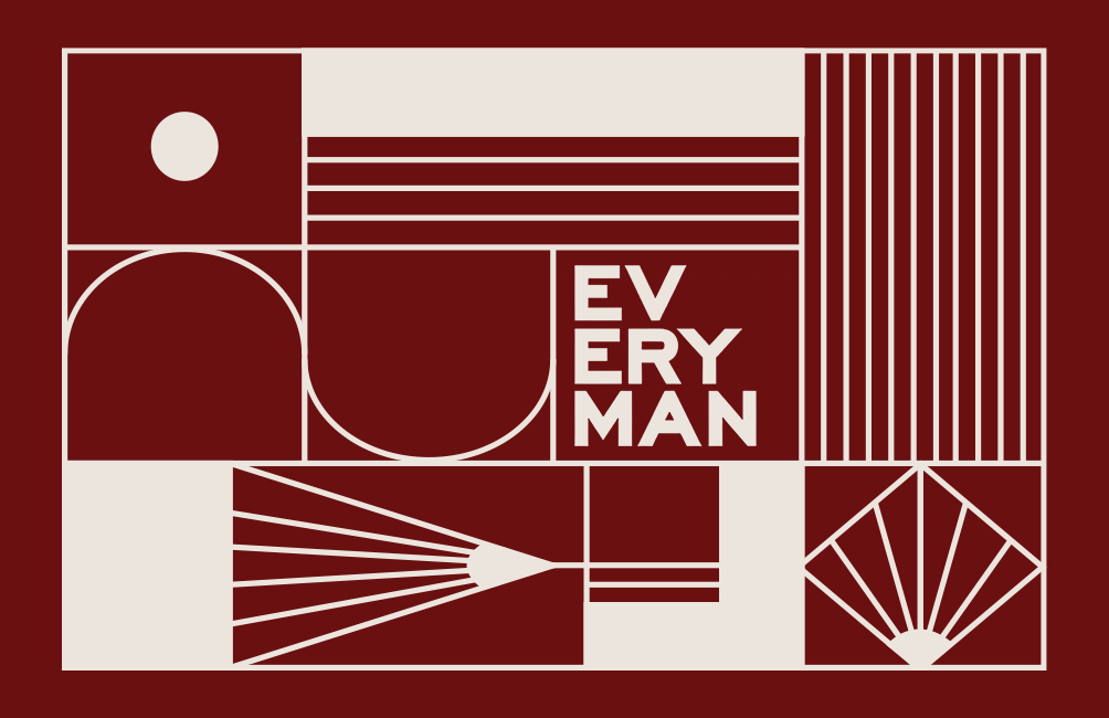
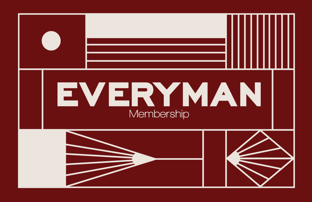

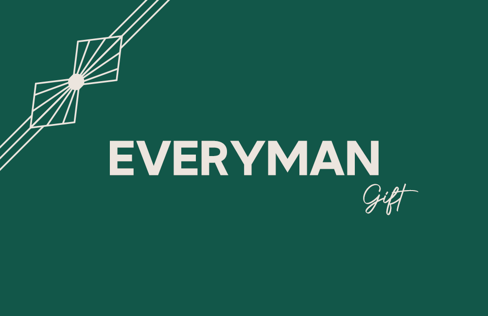

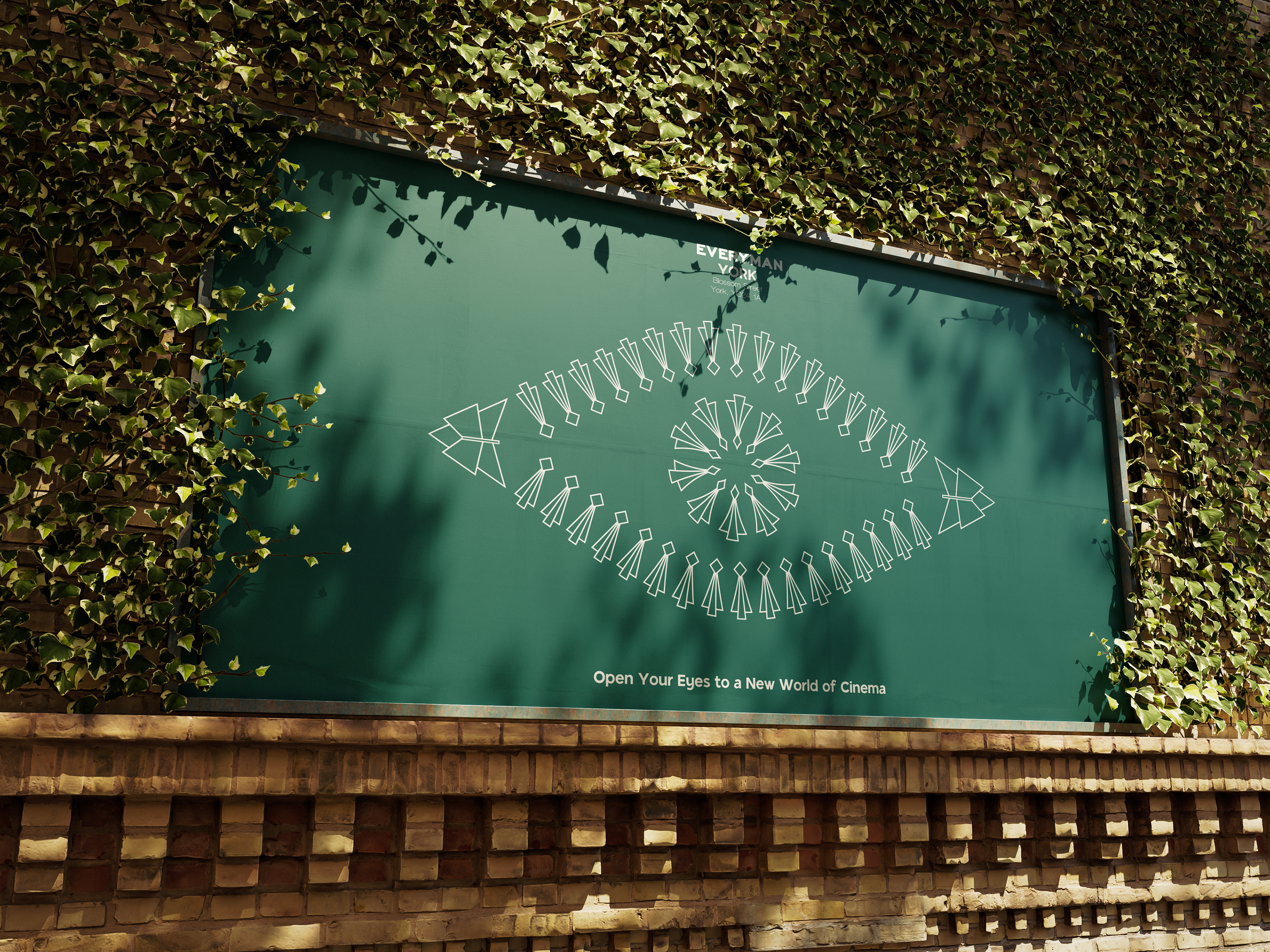
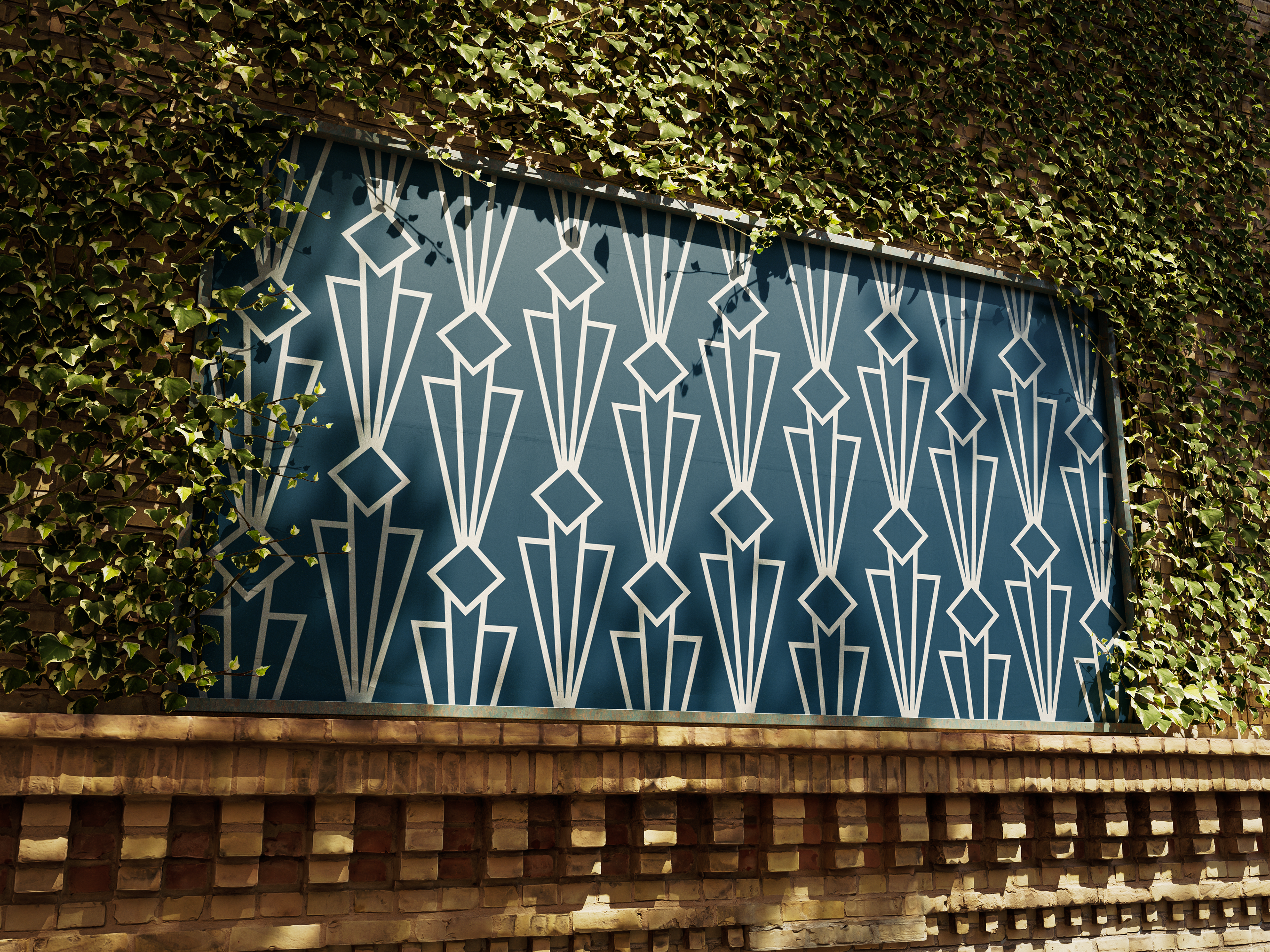
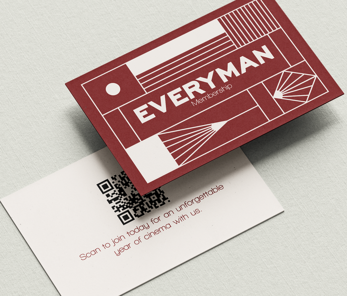
These were the designs for the private hire, gift cards and memberships. The direction the group decided to go in was art deco themed, so there is clear inspiration from art deco design and architecture with the grid design being inspired by the Rockefeller centre in New York.
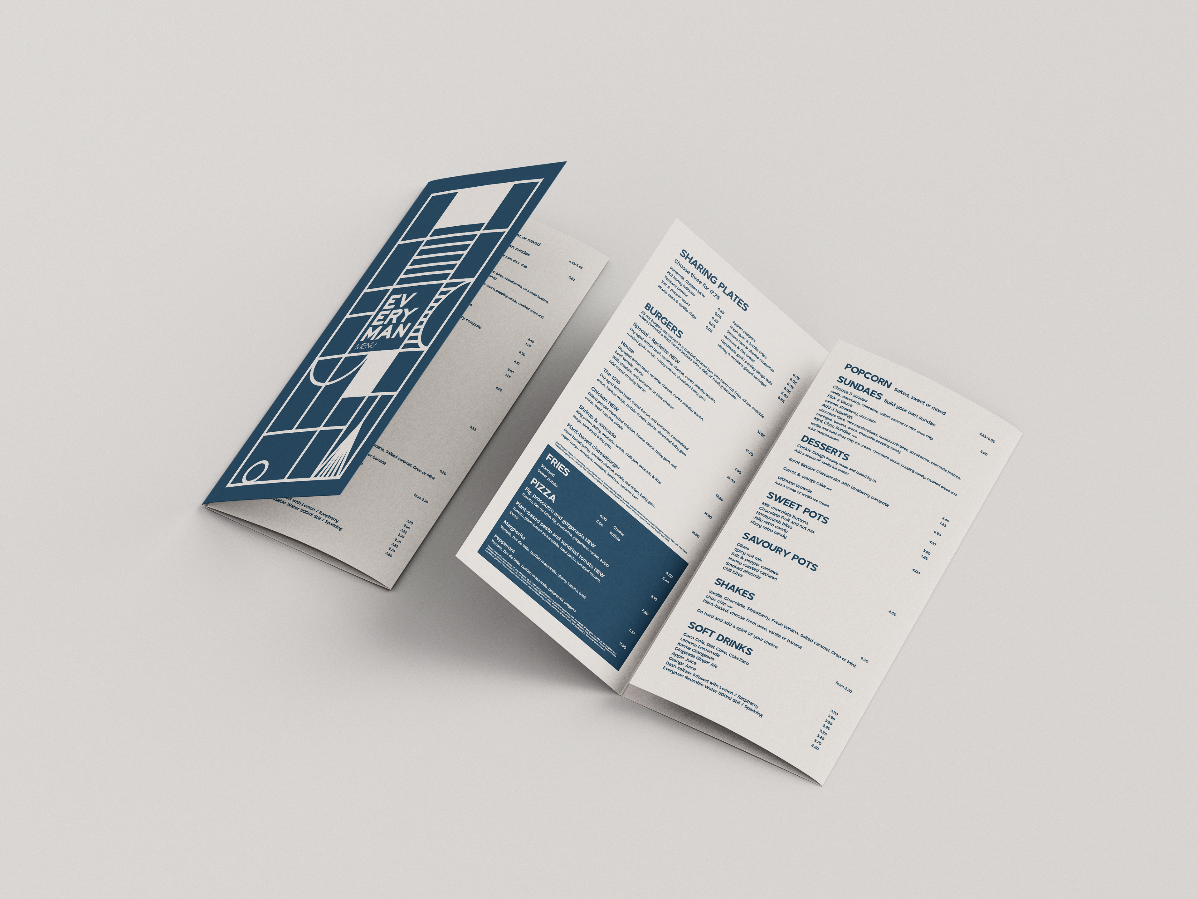
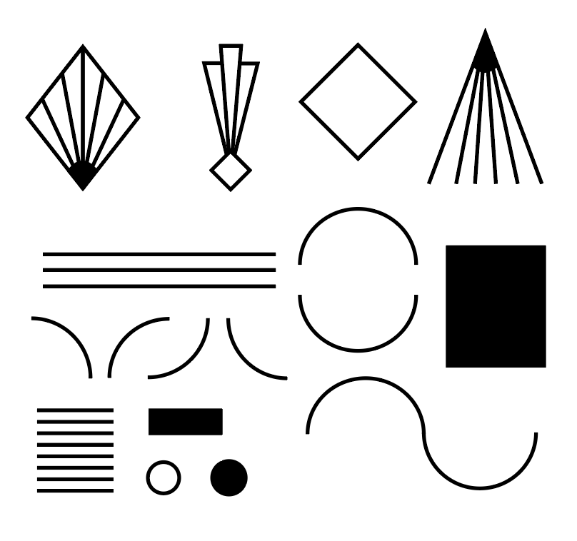
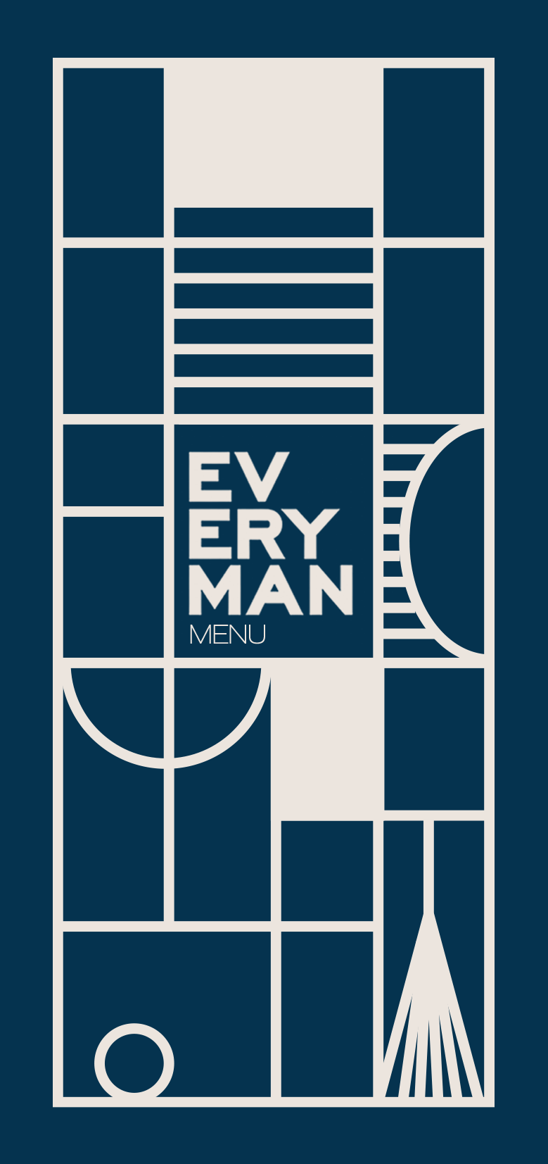
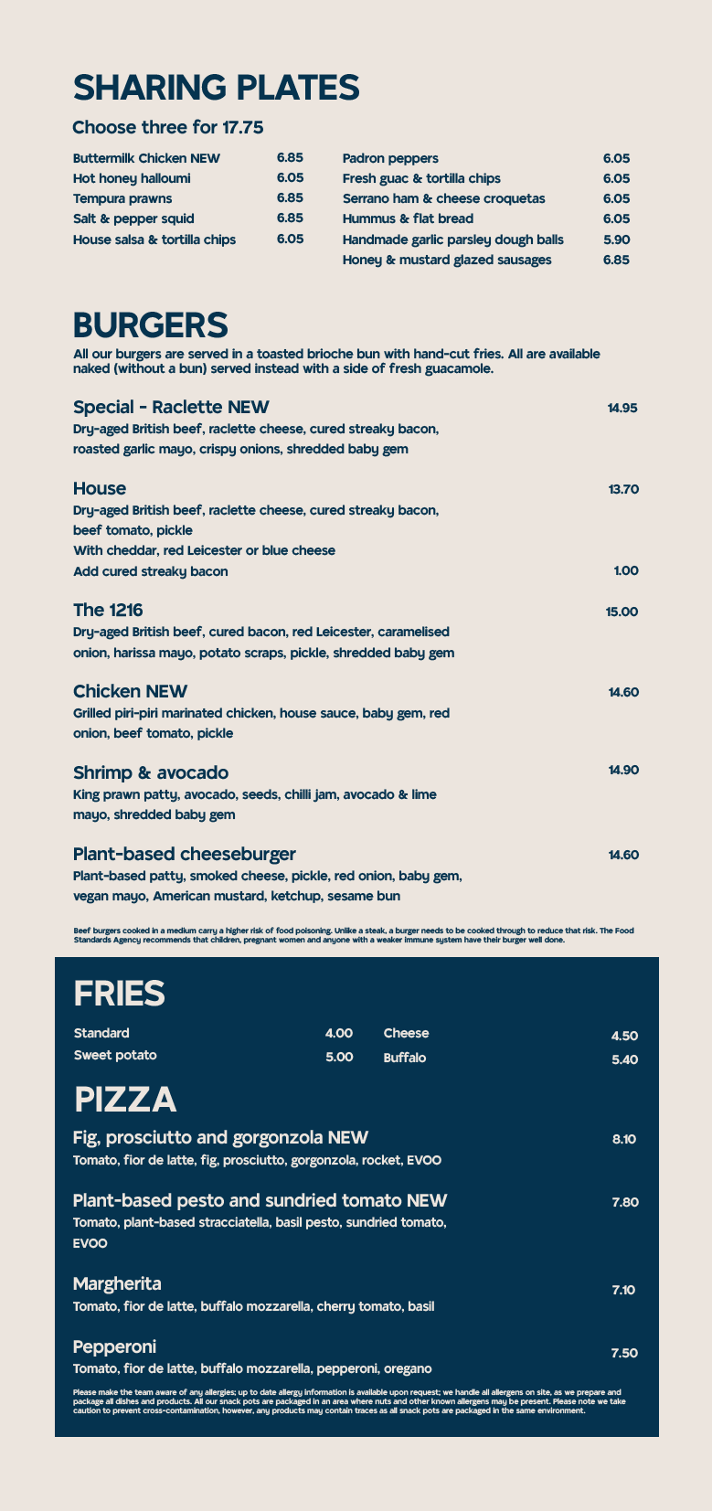
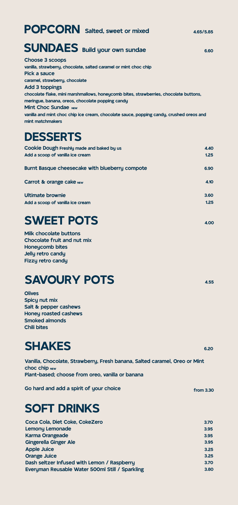
For the project I created a set of shapes that could be used across everyone's work which would help with cohesiveness and these shapes can be seen throughout all the graphic design work. This is the menu design which uses some of the shapes on the front cover swell as a simple layout for the inside pages. An issue with the initial graphic design used at Everyman York is that it doesn't feel like a cohesive set of products and a way I've solved this is by associating colour with the use of the product. All the menus are in blue, the memberships are in red and additional pieces are in green.